About the Blog
Students entering university this fall are a tech-savvy class of “digital natives.” These Gen Zs (born between 1997 and 2015) are not only the most diverse generation, but they are the first generation with virtually no memory of life before the internet.
No longer is it enough to throw together a site with course lists and pages upon pages of information. No, the modern student will expect thoughtful website design with helpful visuals and intelligent, user-friendly navigation. They want to see the most important information first and a clear indication of where to find further details.
An effective "wow factor" must keep up with the latest trends and be ready to adapt to the quickly changing digital landscape actively. The rapid transition universities had to make to online learning following COVID-19 restrictions has led to increased interest and investment in exactly how the online presence can transform the learning experience.

Our agency works closely with university teams, giving us insider intel. So we’ve curated our selection of the top higher education design trends to inspire your next website redesign.
Want a full copy of the infographic?

Perhaps the most complicated part of creating a lightweight and simple design for higher education websites is that the site is burdened with carrying lots of information. With numerous schools, departments, course lists, financial aid information, news stories, and much more, simplifying and organizing this mess is a real chore.
Especially rare, websites that classify this sea of info in a way that makes navigation enjoyable. Deakin University in Australia is one of those rare gems that achieves this task. Not only is their overall design clean and fresh, but the first thing you see are actionable and easy-to-find navigational buttons to direct users.
A prominent search bar on top, large buttons clearly defined, and easy sidebar navigation make sorting through information practically a joy! Plus, the design translates perfectly to handheld devices - a crucial component.
Loyola University of Maryland has an easily navigable right sidebar. First off, at the top of the sidebar is a search bar followed by a tidy list of the most frequented areas of the website (About, Admission & Aid, Academics, Schools, and Campus Life). The hide-away navigation keeps the home screen fresh and image-focused.
With a mere click, all navigation hides away and is available for easy retrieval with a tap on the beckoning green “Menu” and search button in the upper right corner. Simplicity is key in the design of their easy-to-navigate menu. Design-wise it’s almost too sparse, like Excel boxes with text inside. (This allows the on-page design and content to really shine.)
On the flip side, the organization IS Excel-level and expertly so. Each white row indicates a primary, high-level category. Those followed by a little “>” arrow button (like Academics, Admissions, and News and Events) lead to sub-categories within each of these major categories. Those marked with a “↗” upward arrow takes you away from the main site to affiliated university sites like the RISD Museum or Alumni page.

With a continual flood of information, sometimes young people are overwhelmed with the countless options available for their future. Universities that use story to inspire students to find a way to connect with students and shine a guiding light on their education journey. Even better, unique, bold, visual storytelling challenges students to face their future and compels them to react.
John Hopkins University uses catchy slogans that are not only inspiring but captivating. And they don’t stop there. Scroll down their home page, and you will find a collection of various articles with bright visuals exploring the school’s diversity, sustainability, and community initiatives.
For an even more impressive narrative journey, check out the LSU College of Art + Design home page. Here, the school invites potential students to “Click and Scroll” through an interactive and visually inspiring living timeline. Design-minded potential students can visualize their journey from orientation at the university to their future careers.
Each image featured is rich with a story. Potential students can catch glimpses of what they may experience if they attend school here. Featured photo-squares reveal an experience ready to be had. For example, scenes like a student interacting with motion capture technology in a studio on the campus or another with sparks falling as a sculpture class pour bronze.
Lastly, The University of Florida site prominently displays messaging that inspires students (and might also make them chuckle). Just beneath the homepage header is a graphic collection of fresh news stories reflecting the academic values of the university at a high level. Care for the planet, technology initiatives, and stories about marginalized groups all feature in the line-up.

One of the tricky aspects for especially large universities is the diverse range of education systems living under one roof. Some universities realize that these separate schools have very different schools of thought, so providing them their own school sub-brand helps them connect better to prospective students.
One of the most fun parts of visiting a college campus is getting a personalized tour from the admissions team. Well, Dickinson College has found a way to overlap virtual with personalization by offering student-led virtual campus tours and virtual interviews with their admissions team.
The Stanford D. School is the design arm of Stanford University. Their home page includes a gentle wave of threads in the background that reacts and pulsates when a visitor’s mouse pointer collides with any of the threads.
Raw, brutalist design is the UCLA School of Architecture and Urban Design sub-brand signature style. This type of design choice would possibly not be as compelling for someone attending or considering the College of Life Sciences. They might be more interested in the latest studies and research being published in the sciences.
However, here, the thick chunky lines and video + photo “exhibition” pasted on the homepage shine light on the value of the artful and expressive — a sure magnet for those interested in design and architecture.
USC Dornsife College of Letters, Arts, and Science stand-out school sub-brand is a corner dedicated to admitted students. USC Dornsife powerfully illustrates its mission by visualizing creative thinkers envisioning the future - meshing humans with technology.

Student-centered storytelling that helps students envision themselves in your school and inspire them to dream is a powerful tool for higher-ed website design. This trend has been a popular one over the past few years, so the trick here is to be creative and bring student stories front and center in innovative and exciting ways.
We take another look at John Hopkins University's home page for inspiration. Their homepage features a line-up of students, faculty, and alum (on rotation) and showcases select quotes that click over to in-depth articles. This is an excellent way for prospective students to learn more about current students and provide a unique glimpse into the university’s life.
North Carolina State University Campus Life page highlights student-led organizations and features unique activities for a wide range of interests.
Feature the diversity of interests at your institution by leading with student engagement in campus organizations. NC State University has one-of-a-kind student learning villages to encourage smaller communities to form and create more engaging and diverse student involvement.
With a simple statement, William and Mary devote an entire section to present and past students, faculty, and staff. This overall feature is an easy-to-replicate section that showcases stand-out students, alumni, and faculty with portrait photography and a sleek interface.

In light of restrictions and social distancing, schools were burdened with distance learning and, at the same time, still needed to find a way to recruit students.
That’s where interactive elements such as virtual tours, on-demand information sessions, and chatbots for quick answers to questions came into play. Campuses employing these tools were able to connect with prospective students - maybe even better than before.
One of the most fun parts of visiting a college campus is getting a personalized tour from the admissions team. Well, Dickinson College has found a way to overlap virtual with personal. At Dickinson College, there is a wide range of virtual options, such as student-led virtual campus tours. They offer a variety of virtual options, including virtual interviews with their admissions team and virtual info sessions.
On The George Washington University site, it’s easy to find virtual visits and, even better, an archive of on-demand information sessions. The on-demand sessions include watchable content for prospective students and useful transfer information.
Chapman University takes chat to the next level and creates 1-to-1 student connections before the admissions process. Questions that were once answered only on college tours can now be answered right away with live chat.
Prospective students can connect directly with current student ambassadors from various disciplines or even with university staff. Technology like Unibuddy helps any higher education institution implement this.

TikTok meets Ivy League. Playful, vertical video stories and sprightly social content akin to Instagram, YouTube, and TikTok are making their way to higher ed websites for a familiar experience to Gen Z.
But really, we seriously mean Ivy League, like Brown University. These short snippets spark interest in what the university may have to offer and come directly out the mouth of ordinary students. Seemingly unedited and natural, the messaging feels authentic, compelling, and even insightful.
Keeping in line with the vertical look, the Rochester Institute of Technology features “Faces of RIT,” a video collection peeking into their academic world. The videos feature students and professors alike. The kicker here is that the design makes navigation on mobile especially enjoyable.
Perhaps the trendiest of the bunch, Penn State is active on the socials and even created their own response to COVID-19 in the form of a catchy campaign: #maskuporpackup. Regular content on several social media sites spreads visibility and encourages sharing across platforms.
With Gen Z, this is not something you can ignore, as social media plays a massive part in their everyday lives. Employ YouTube, Instagram, Snapchat, and even TikTok to stay relevant for your student body.

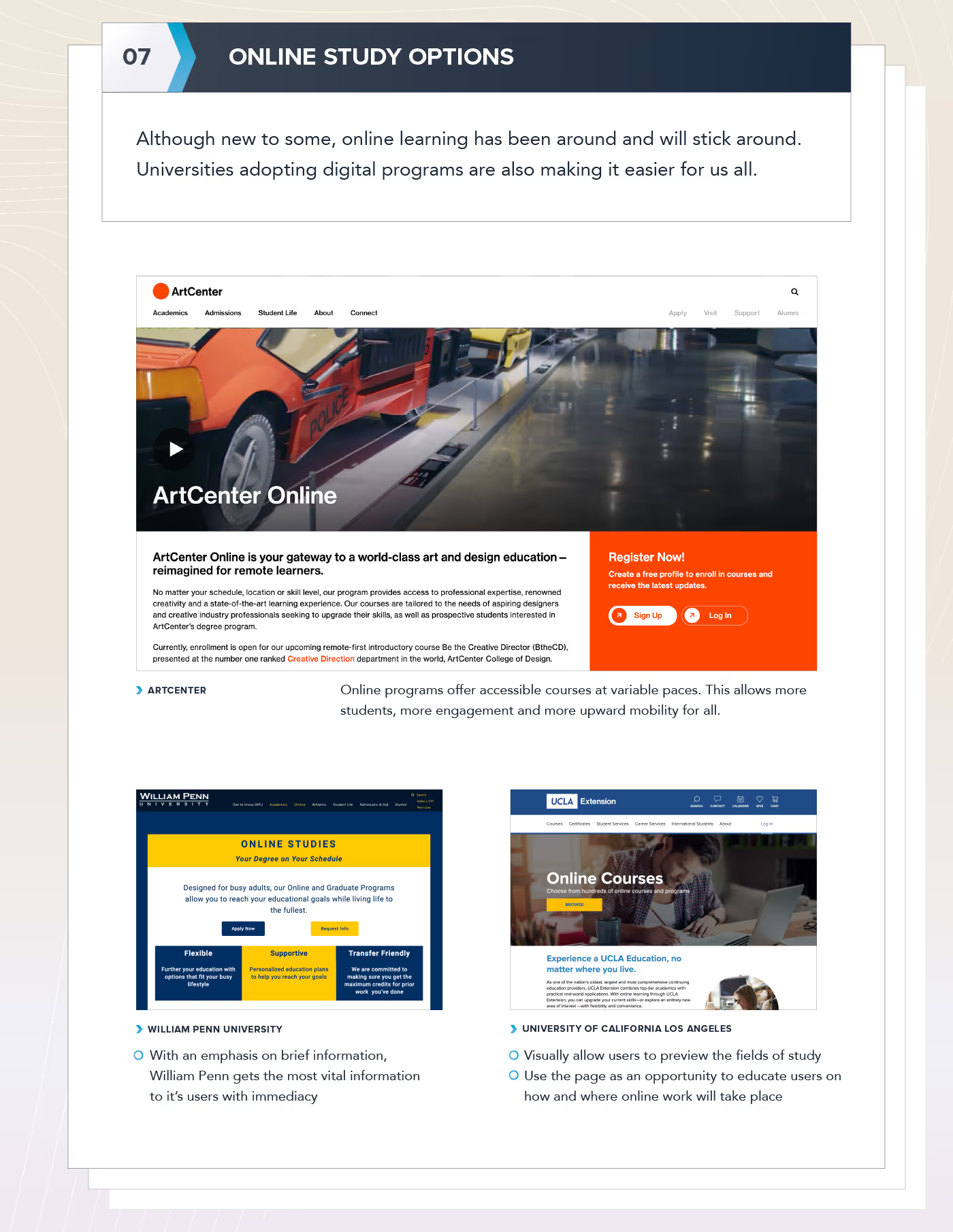
Before the COVID-19 pandemic, online study options were never fully embraced by nonprofit private and public schools. Sure, some forward-thinking professors would offer online or hybrid courses, but few schools made distance learning an institutional priority. Yet, the reality is a group of adults—approximately 6 million in 2019—were committed to online degree programs before COVID, and they will continue to be committed years after the pandemic. If anything, the past three years have made more people comfortable with online learning.
Schools are finally responding. They have revamped their websites and made it easier to find online study options. For instance, ArtCenter College of Design in Pasadena promotes its two tracks—transportation design and creative direction—on the school’s homepage. When users click on the page, they see a highly-produced introduction video that offers prospective students a glimpse of their online learning experience. Even better, ArtCenter allows applicants to customize their learning paths. They can study on their own with video-only tutorials or they can register for weekly instructor critiques that lead to a credential.
William Penn University in Iowa has a less slick but still effective approach to recruiting distance learners. The university does not delve into student life, quick facts about the first-year class, or take a deep dive into the school’s history. Instead, William Penn delves into the issues that matter most to its audience: What does the program cost? How long does it take to graduate? William Penn designed its programs for busy adults, and it follows through on this mission by making it easy for applicants to get help. The website includes information on how to text, call, and email with questions as well as an online calendar tool that lets them schedule calls early in the morning or late at night, seven days a week.

Good web design should never waste a person's time. Yet, many of us have had negative experiences searching for information on a website and never finding it. Mega menus are one way to provide comprehensive resources without overwhelming users. These menus expand and easily show main topics and in some cases, their second-level pages. Think of it as a better, more user-friendly site map that is always accessible to visitors.
Boston University School of Public Health gives users a simplified and traditional way to navigate a website with the main menu across the top. It also offers a “full menu” that enables visitors to use a search bar, see a list of first- and second-level pages, and click on buttons for links and resources segmented by audience type (think faculty, alumni, and students). It takes into account that people have different ways of searching for information but still offers a clean and simple design. To make the navigation process easier, the mega menu has categorized pages into topics such as “Think” (news stories and research highlights), “Do” (events listings), and “Teach” (admissions).
UC Berkley’s School of Public Health’s homepage includes only four links on its main navigation bar. It is a refreshingly low number given that most other institutions use a banner bar, a horizontal main menu bar, and a side navigation bar with as many as 10 links. Instead, Berkeley relies on a mega menu to provide links to its landing pages, social media channels, and COVID-19 resources. There is even a Give Now button and image. The mega menu is so well designed with it feels like you are visiting a new web page without having to click away from the home page.
Want a full copy of the infographic?

Download your complimentary Brand Manifesto Workbook today!
Note: This post is sponsored by our friends at UNINCORPORATED. It was originally posted on the UNICORPORATED blog.
Topics: Branding Agency, Brand Development


