


About the Blog
Still treating your program pages like digital course catalogs? You’re leaving conversions on the table.
In this episode of The Application, I sat down with Brittney Miller and Brit Heppler from Angelo State University to talk about what happens when you stop treating your program pages as an afterthought—and start treating them like what they are: your most valuable recruitment tools.
Their strategy didn’t involve just sprinkling in some buzzwords or adding a new hero image. It was a full-on reimagination of what prospective students (and their parents) want, need, and expect from a program page.
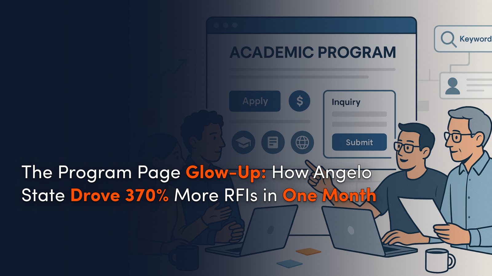
The payoff? A 370% increase in RFI submissions—in just one month.
Let’s break down how they did it—and what you can try for your own site.
Program Pages Are Recruitment Pages—Full Stop
As Brittney puts it, your website is where all roads lead. Whether a student hears about your institution through TikTok, an email, a billboard, or a college fair, their next move is to either ask ChatGPT or Google your program. That means your academic program pages have to pull weight.
Before the redesign, Angelo State’s pages were underwhelming: no clear next steps, minimal content depth, and zero context for cost or career outcomes. So they started fresh, building around the real questions students ask when exploring majors: Do you have what I want? Can I afford it? Will this get me where I want to go?
Small Forms, Big Impact
One of the most tactical—and effective—changes the team made? Swapping one long, generic RFI form for short, program-specific forms embedded directly into each page.
That change alone took them from 128 RFIs to more than 600 in just one month.
They paired it with: reorganized content, clear calls-to-action, better internal navigation, and page designs that let users scroll naturally through decision-making information. uddenly you’ve got a recruitment machine, not a digital filing cabinet.
Faculty Collaboration Meets SEO Strategy
What’s especially impressive about Angelo State’s approach is how they bridged the common divide between marketing and academics. Working closely with faculty, Britt and Brit uncovered the differentiators that matter—faculty accolades, unique research opportunities, standout career paths—and baked them into copy that both humans and search engines love.
Here’s Brit’s content playbook:? Start with data, but stay human. She used BrightEdge to surface keyword opportunities, then translated those into accessible copy with a freshman-level reading grade. This isn’t about simplifying content—it’s about meeting your audience where they are, while still respecting the institution’s voice and academic credibility.
Program Pages as Living Assets
Perhaps the biggest takeaway from this episode: these pages aren’t set-and-forget.
They’re living assets. Brittney’s team tracks performance constantly—especially RFI submissions, click-throughs to financial aid pages, and engagement across consolidated content.
Their process isn’t revolutionary, but it is refreshingly rigorous: audit, revise, collaborate, test, repeat. Whether it’s adding a new degree track or testing video thumbnails for YouTube SEO, this is an approach grounded in iteration, not perfection.
A Smarter Way to Use AI
Yes, AI is in the mix. But not in the way you might expect. The Angelo State team uses tools like ChatGPT to speed up meta description creation, repurpose content for video, and ideate page microcopy. But every output is human-reviewed and refined.
The lesson here? AI can support your team, not replace it. Content strategy is still a human job, rooted in empathy, audience understanding, and storytelling.
TL;DR Takeaways for Enrollment Marketers
- Treat your program pages like the digital front door they are—not just repositories of information.
- Shorten and customize your forms. Make it easy to raise a hand.
- Collaborate with faculty, but lead with data and user behavior.
- Track what matters (RFIs, financial aid clicks, page engagement) and iterate often.
- Use AI to accelerate, not automate, your content strategy.
Whether you’re a one-person shop or part of a large marketing team, this episode is packed with tactical inspiration. Britt and Brit’s story proves that you don’t need a flashy redesign to get results—you need focus, buy-in, and a commitment to clarity.
Listen to the full episode of “The Application” wherever you get your podcasts.


.svg)
.svg)
