


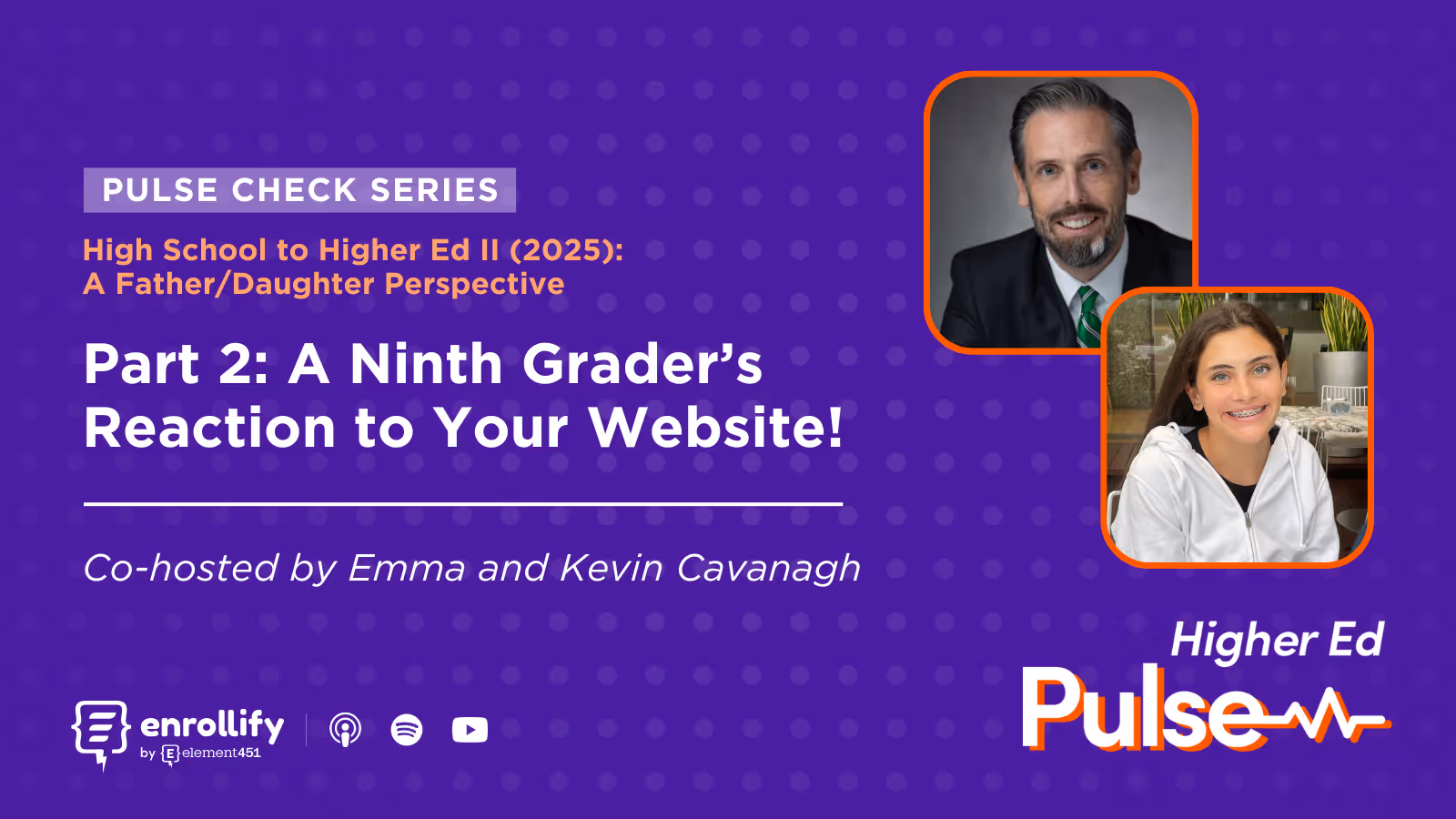

About the Episode
About The Episode:
Kevin and Emma Cavanagh dive into what makes a college website stand out—or fall flat—for prospective students. With Emma reviewing 10 university websites prompted by recent outreach efforts, the duo explores why first impressions, clean design, and simple navigation make all the difference in a Gen Z user's experience. For higher ed marketers, this is a must-listen crash course in what your future applicants actually notice (and what makes them bounce).
Key Takeaways
- Videos are a must. Dynamic, well-produced homepage videos that reflect campus life and culture help draw students in emotionally.
- Simple, intuitive navigation wins. A clearly visible and well-organized menu bar—especially one with "Apply," "Visit," and "Request Info" links—is key to student usability.
- Aesthetic matters. Color schemes that align with school branding and offer visual appeal (without being overwhelming) help build a memorable experience.
- Avoid information overload. Busy, cluttered layouts with excessive blocks of text or giant graphics turn students away.
- Highlight real value, not vanity metrics. Students care more about opportunities and facilities than arbitrary rankings or braggy alumni name drops.
- Websites won’t make the final decision—but they can take you off the list. A poorly designed or confusing website can diminish a school’s appeal instantly.
What Makes a College Website “Work” for Students?
Emma, a ninth grader deep in the early stages of the college discovery process, recently visited 10 college websites at the suggestion of her high school’s guidance tools—and of course, from emails flooding her inbox. What she found were sharp contrasts in quality, user experience, and design.
Standouts like James Madison University, Tufts, Penn State, and the University of Alabama got her attention. What did they do right? First, they prioritized easy-to-use top navigation bars with links to the essentials—applying, visiting, and learning about academics. But the real MVPs were the homepage videos: brief, visually appealing overviews of campus life and student experience that sparked curiosity without overwhelming.
For Emma, “inspiring” means seeing the vibe of the school. Not just buildings, but activities, students interacting, and actual glimpses of life on campus. These videos—and the sites overall—left her with a better impression of the schools than she had before.
What Doesn’t Work? The “Vanilla” Experience
The episode’s unofficial theme, thanks to National Vanilla Pudding Day, is “vanilla websites”—those that are plain, uninspired, or simply not made with students in mind. Emma walks through several anonymous examples (for the sake of diplomacy), all of which suffered from one or more of the following:
- Information overload: Giant content blocks, irrelevant updates, or lists of accolades that don’t connect to the student experience.
- Confusing hierarchy: Navigation that leads nowhere, or page designs where font overlays obscure background videos or imagery.
- Unbalanced branding: Some schools went all-in on gradients or color combos that made it hard to focus or follow the flow of information.
- Outdated visuals or missing multimedia: In 2025, not having a video on your homepage—or using iconography from the early 2000s—feels like a miss.
Emma’s verdict? These sites didn’t just fail to move her forward—they pushed her further away from interest in the school. For Gen Z users, one clunky or outdated experience is enough to trigger a silent but final "no thanks."
What Do Students Actually Use College Websites For?
This episode doesn’t just critique—it informs. Emma admits she’s unlikely to use a website to decide whether to apply to a school. But she will use it to:
- Find visit opportunities or open houses
- Explore majors and programs tied to her interests (like journalism)
- See what day-to-day student life looks like
- Understand whether the college “gets” students like her
A key insight here: Websites won’t close the deal, but they can absolutely break it. Emma points out that even a school she liked dropped a few notches in her mind simply because its site was overwhelming, uninviting, or seemingly built for anyone but students.
Kevin adds an insider perspective—some of the weaker sites likely reflect internal political compromises: content for donors, faculty, or alumni taking precedence over prospective student needs. It’s a reminder that clarity of audience is everything in higher ed content marketing.
Emma's email: emma.cavanaghnj@gmail.com
Enrollify is produced by Element451 — the next-generation AI student engagement platform helping institutions create meaningful and personalized interactions with students. Learn more at element451.com.
Attend the 2025 Engage Summit!
The Engage Summit is the premier conference for forward-thinking leaders and practitioners dedicated to exploring the transformative power of AI in education.
Explore the strategies and tools to step into the next generation of student engagement, supercharged by AI. You'll leave ready to deliver the most personalized digital engagement experience every step of the way.
👉🏻 Register now to secure your spot in Charlotte, NC, on June 24-25, 2025! Early bird registration ends February 1st.

.png)
.svg)
.svg)
