


About the Episode
Got a story to tell? An innovative idea to share? Fill out our guest nomination form and let's chat!
About the Episode:
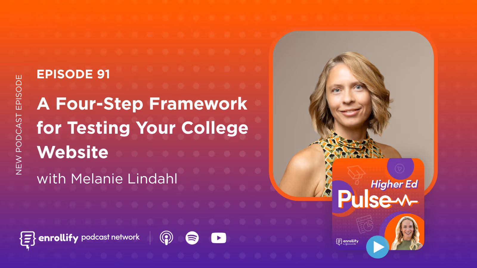
In this episode of Higher Ed Pulse, host Mallory Willsea sits down with two-time Red Stapler winner Melanie Lindahl, Senior UX and Web Designer at the University of Texas at Austin School of Law. Together, they unpack why so many college websites fail usability tests — and what higher ed marketers can do about it. Melanie reveals her four-part user testing framework and explains why even beautifully designed sites often miss the mark for real users. From spicy clicks to system flaws, this episode is a must-listen for anyone looking to build student-first digital experiences.
Key Takeaways
- User testing is not a luxury — it's a necessity
Higher ed websites fail because they're designed without real user input. Testing with just five users can uncover 85% of usability issues. - Melanie's 4-part testing framework: Find, Prepare, Test, Analyze
This simple, actionable model helps teams build a user-centered website development process without needing massive resources. - You're not testing the user — you're testing your system
Reframing usability testing this way helps reduce participant anxiety and clarifies your real goal: finding design flaws. - Small issues can be big problems
One misaligned link or vague button label can derail a student's journey. Even minor spicy clicks reveal major insights. - Culture beats permission
Don’t wait for leadership buy-in — build user testing into your process by default and let the data speak for itself. - Video clips of testing sessions can be your most persuasive tool
Compilation videos of users struggling with site navigation can be powerful ammunition for stakeholder buy-in.
Episode Summary
Why do most college websites fail usability tests?
Melanie Lindahl starts the episode by addressing a frustrating reality: many higher ed websites are beautifully designed yet still deeply flawed. From confusing buttons to broken task flows, students often struggle to complete even the most basic online actions. According to Melanie, the solution isn’t a flashy redesign — it’s simple, regular user testing. And you don’t need a giant sample size to make a difference. Just five users can expose the vast majority of issues.
Even websites that seem well-designed can falter under scrutiny. Melanie points to personal examples, like her own banking apps or even Apple’s new "liquid glass" UI, to show how poor contrast and unclear labels can alienate users. The key takeaway? You’re not immune. Even top-tier design work needs validation from real users.
What’s the difference between knowing your users and knowing what they do?
This was one of Melanie’s boldest — and most memorable — takeaways from her Digital Collegium session: “Knowing your users isn't the same as knowing what they do.” It's easy to make assumptions about user behavior based on demographics or past surveys, but Melanie explains that true insights come from observing real-time user behavior during usability tests. Every time she runs a test, she uncovers something unexpected — something that no amount of "knowing your audience" could predict.
That distinction has deeply changed how Melanie approaches her work. Rather than relying on assumptions, her team embeds testing throughout the development cycle to course-correct based on actual user behavior, not theoretical needs.
How do you build a culture of testing without waiting for approval?
Here’s where Melanie gets radical — in the best way. She doesn’t ask for permission to run usability tests. She just does it. “Why would I ask permission to do something the right way?” she says. User testing is baked into her team’s development life cycle from day one, and the insights gathered from each round of testing help make the case for design improvements far more effectively than a pitch deck ever could.
For skeptics or leaders who need convincing, Melanie recommends assembling short compilation videos of users hitting roadblocks during tests. These clips tell a story far more powerful than any set of analytics or reports could — and they highlight problems in a way that’s impossible to ignore.
What is Melanie's usability testing framework?
Melanie’s framework is refreshingly simple: Find, Prepare, Test, Analyze.
- Find — Identify your primary user groups and keep your audience scope manageable. Focus on testing users with significantly different needs, especially if their journeys through your site are unique.
- Prepare — This phase is where many mistakes happen. Melanie warns against task bias — accidentally leading users toward the answer you’re hoping for. She also advises checking assumptions at the door and letting tasks flow naturally from one to the next.
- Test — Melanie prefers remote testing because it allows her to view the user’s facial expressions and screen simultaneously. During tests, she refrains from intervening unless necessary, allowing users to navigate freely — even if they veer off course. That “spicy click” they make? That’s often where the gold is.
- Analyze — This is the most overlooked phase, and the one where Melanie urges teams to slow down. She blocks out dedicated time to reflect on what she’s seen and categorize feedback to identify patterns. One failed task may warrant a design tweak; two usually signals a major UI flaw.
What’s a “spicy click” and why does it matter?
A spicy click is Melanie’s term for when a user does something totally unexpected during a test — clicks something odd, navigates to a surprising page, or chooses a path you didn’t predict. These moments are critical because they uncover flaws in your assumptions about how users think and behave.
Rather than dismissing spicy clicks as edge cases, Melanie embraces them as clues. They reveal cognitive dissonance between what your site is trying to communicate and how users actually interpret it. That’s a design opportunity in disguise.
How do you know if it’s a usability problem or just a user preference?
Melanie admits there’s no hard rule here — you have to dig into context. If one user struggles, she investigates further. If two or more do, it’s likely a systemic issue. Either way, she listens carefully to what users say and watches what they do. It's about patterns, not perfection.
She also shares a powerful example from UT Law: a student lost access to critical admitted-student content the moment their status changed to "current student." That one comment changed the trajectory of the project — leading to a new, widely-loved portal that solved multiple pain points for students and staff alike.
What’s one small step anyone can take to start testing?
Just start talking to your users. That’s it. Even informal conversations can uncover hidden frustrations or unmet needs. You don’t need a massive platform or formal testing tools to begin. Keep a backlog, start listening, and let the feedback guide your next steps.
Connect With Our Host:
Mallory Willsea
https://www.linkedin.com/in/mallorywillsea/
https://twitter.com/mallorywillsea
About The Enrollify Podcast Network: The Higher Ed Pulse is a part of the Enrollify Podcast Network. If you like this podcast, chances are you’ll like other Enrollify shows too!
Some of our favorites include Generation AI and Confessions of a Higher Education Social Media Manager.
Enrollify is produced by Element451 — the next-generation AI student engagement platform helping institutions create meaningful and personalized interactions with students. Learn more at element451.com.

.png)
.svg)
.svg)
